Are you looking for an easy way to implement a fully customizable, nicely animated progress circle in QML?
This is the way to go:
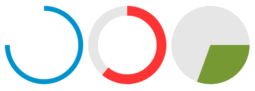
Use a canvas control to paint the arc and a full circle as a background. You can set the size of the control, colort and the start and end angle of the arc. If you change the angles, the change will be animated – of course, you can turn the animation off. If isPie set to true, a pie segment is painted instead of an animation.
ProgressCircle.cml:
// ByteBau (Jörn Buchholz) @bytebau.com

import QtQuick 2.0
import QtQml 2.2

Item {
    id: root

    width: size
    height: size

    property int size: 200               // The size of the circle in pixel
    property real arcBegin: 0            // start arc angle in degree
    property real arcEnd: 270            // end arc angle in degree
    property real arcOffset: 0           // rotation
    property bool isPie: false           // paint a pie instead of an arc
    property bool showBackground: false  // a full circle as a background of the arc
    property real lineWidth: 20          // width of the line
    property string colorCircle: "#CC3333"
    property string colorBackground: "#779933"

    property alias beginAnimation: animationArcBegin.enabled
    property alias endAnimation: animationArcEnd.enabled

    property int animationDuration: 200

    onArcBeginChanged: canvas.requestPaint()
    onArcEndChanged: canvas.requestPaint()

    Behavior on arcBegin {
       id: animationArcBegin
       enabled: true
       NumberAnimation {
           duration: root.animationDuration
           easing.type: Easing.InOutCubic
       }
    }

    Behavior on arcEnd {
       id: animationArcEnd
       enabled: true
       NumberAnimation {
           duration: root.animationDuration
           easing.type: Easing.InOutCubic
       }
    }

    Canvas {
        id: canvas
        anchors.fill: parent
        rotation: -90 + parent.arcOffset

        onPaint: {
            var ctx = getContext("2d")
            var x = width / 2
            var y = height / 2
            var start = Math.PI * (parent.arcBegin / 180)
            var end = Math.PI * (parent.arcEnd / 180)
            ctx.reset()

            if (root.isPie) {
                if (root.showBackground) {
                    ctx.beginPath()
                    ctx.fillStyle = root.colorBackground
                    ctx.moveTo(x, y)
                    ctx.arc(x, y, width / 2, 0, Math.PI * 2, false)
                    ctx.lineTo(x, y)
                    ctx.fill()
                }
                ctx.beginPath()
                ctx.fillStyle = root.colorCircle
                ctx.moveTo(x, y)
                ctx.arc(x, y, width / 2, start, end, false)
                ctx.lineTo(x, y)
                ctx.fill()
            } else {
                if (root.showBackground) {
                    ctx.beginPath();
                    ctx.arc(x, y, (width / 2) - parent.lineWidth / 2, 0, Math.PI * 2, false)
                    ctx.lineWidth = root.lineWidth
                    ctx.strokeStyle = root.colorBackground
                    ctx.stroke()
                }
                ctx.beginPath();
                ctx.arc(x, y, (width / 2) - parent.lineWidth / 2, start, end, false)
                ctx.lineWidth = root.lineWidth
                ctx.strokeStyle = root.colorCircle
                ctx.stroke()
            }
        }
    }
}
To use the component like in the picture above, just place it inside a layout container like this:
Row {
    anchors.centerIn: parent
    spacing: 10

    ProgressCircle {
        size: 160
        colorCircle: "#0092CC"
        colorBackground: "#E6E6E6"
        arcBegin: 0
        arcEnd: 270
        lineWidth: 10
    }

    ProgressCircle {
        size: 160
        colorCircle: "#FF3333"
        colorBackground: "#E6E6E6"
         showBackground: true
         arcBegin: 0
         arcEnd: 220
    }

    ProgressCircle {
        size: 160
        colorCircle: "#779933"
        colorBackground: "#E6E6E6"
         showBackground: true
        isPie: true
        arcBegin: 90
        arcEnd: 200
    }
}
This is awesome! Thanks a lot for sharing this!
thankful Professor
Really good, thanks a lot!