Building a Custom Component for Android with Kotlin or QML – A Comparison

When creating UIs it’s a common task to build your own set of reusable UI Components, if you dont want to rely on the built-in set of the framework.
I was very curious how this is done in native Android app-development and how this fancy new language Kotlin works in this context.
A quick search brought me to this excellent tutorial from Eley “Building Custom Component with Kotlin”.

So here is the goal:

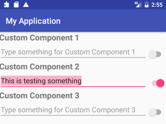
Create a reusable component which contains a label, an editable textline and a switch, formatted as you can see in the picture below (original picture slightly adjusted).

I will show the lines of code you need to achieve this goal with Native Android + Kotlin on the one hand and Android -styled QML on the other hand.

Continue …

Scalable Icon Button

Scalable Icon Button

In the previous post we have seen, how to create icons which scale properly. Additionally I have added a scalingFactor property to the IconSVG:

//IconSVG.qml
import QtQuick 2.0
import QtQuick.Window 2.2
import QtGraphicalEffects 1.0

Image {
    id: root

    property alias color: colorOverlay.color
    property int size: 24  // default
    property real scalingFactor: 1

    sourceSize.width: size * scalingFactor
    sourceSize.height: size * scalingFactor

    ColorOverlay {
        id: colorOverlay
        anchors.fill: root
        source: root
        color: "#000000"
    }
}

Now let’s see, how this can be useful in a real usecase.

Continue …

Scalable SVG Icons

It’s a lot of work to provide icons for mobile devices, because of the large number of different formfactors and screen pixel-densities.

Android is using the following set of values:

Name DPI Scaling Factor Default Icon Size
ldpi (low) ~120dpi 0.7 18 x 18
mdpi (medium) ~160dpi 1.0 24 x 24
hdpi (high) ~240dpi 1.5 36 x 36
xhdpi (extra-high) ~320dpi 2.0 48 x 48
xxhdpi (extra-extra-high) ~480dpi 3.0 72 x 72
xxxhdpi (extra-extra-extra-high) ~640dpi 4.0 96 x 96

Source: http://developer.android.com/guide/practices/screens_support.html

To ensure that you get sharp icon shapes you need to provide different icon-files (usually png-files) for each DPI class.

Continue …

Progress Circle with QML and Canvas

progress-circle

Are you looking for an easy way to implement a fully customizable, nicely animated progress circle in QML?

This is the way to go:

Use a canvas control to paint the arc and a full circle as a background. You can set the size of the control, colort and the start and end angle of the arc. If you change the angles, the change will be animated – of course, you can turn the animation off. If isPie set to true, a pie segment is painted instead of an animation.

Continue …