In this a article I want to provide some solutions for problems I was facing, when I started to use the Flutter™ TextField Widget for the first time.
Use the different Types of Labels
Textfields are able to display labels in a variety of different areas by assigning a InputDecoration object to the decoration property. Here are some examples:
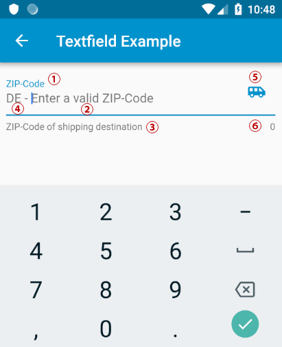
labelText: Text that describes the input field. When the input field is empty and unfocused, the label is displayed on top of the input field.hintText: Text that suggests what sort of input the field accepts. Displayed on top of the input child when the input isEmpty and either (a) labelText is null or (b) the input has the focus.helperTextanderrorText: Text that provides context about the input child’s value, such as how the value will be used. If non-null, the text is displayed below the input child, in the same location as errorText. If a non-null errorText value is specified then the helper text is not shown.prefixText or prefixIcon: Optional text prefix to place on the line before the input. Prefix is not returned as part of the input. In this example a 2 digit ISO country code.suffixIcon or suffixText: An icon that that appears after the input and suffixText and within the decoration’s container.counterText: Optional text to place below the line as a character count.
The implementation of the example would look like:
TextField(
   controller: _textController,
   keyboardType: TextInputType.number,

   decoration: InputDecoration(
     hintText: 'Enter a valid ZIP-Code',
     errorText: _hasInputError ? "ZIP-Code is too short" : null,
     counterText: _textController.text.length.toString(),
     helperText: "ZIP-Code of shipping destination",
     labelText: "ZIP-Code",
     prefixText: "DE - ",
     suffixIcon: Icon(Icons.airport_shuttle),
   ),
),
Set an Initial Value
Unfortunately we can’t set access the a text property of the To give the TextField directly. For this we need TextEditingController which is initialized in the State of a parent Widget. The text property can than set to an initial value in the initState() method.
class _TestPageState extends State<TestPage> {
  static final TextEditingController _textController = TextEditingController();

  @override
  void initState() {
    super.initState();
    _textController.text = "Hallo";
  }

  @override
  Widget build(BuildContext context) {
    return Scaffold(
      body: Padding(
        padding: const EdgeInsets.all(8.0),
        child: TextField(
          controller: _textController,
        ),
      )
    );
  }

}
Set the Keyboard Type
This is an easy task: Assign an TextInputType to the keyboardType property. Available types are:
- datetime for date and time information
- emailAddress for email addresses
- multiline for multi-line textual information
- number for unsigned numerical information without a decimal point.
- phone for telephone numbers
- text for textual information
- url for URLs.
- values for all possible enum values.
TextField(
   controller: _textController,
   keyboardType: TextInputType.number,
),
Create an Expandable Multiline Textfield
By default the TextField displays only one line of text. The number of lines can be set by the maxLines property to a fixed value. When you set maxLines to null the number of lines automatically increase/decrease, depending on the length of the text.
TextField(
   maxLines: null,
   keyboardType: TextInputType.text,
)
Simple Validation
An a simple way do validate an input is to implement it directly in the onChanged callback. Here you have access to the current text-value. In the following example the length of the text is checked. If too short _hasInputError is set to true and setState is called to update the errorText of theInputDecoration.
class _TestPageState extends State<TestPage> {

  bool _hasInputError = false;

  @override
  Widget build(BuildContext context) {
    return Scaffold(
      body: Padding(
        padding: const EdgeInsets.all(8.0),
        child: TextField(
           onChanged: (value){
             _hasInputError = value.length < 5;
             setState(() {});
           },
           decoration: InputDecoration(
             errorText: _hasInputError ? "ZIP-Code is too short" : null,
           ),
        ),
      )
    );
  }

}
Validation with TextInputFormatter
A more flexible way to validate the input is the use of a TextInputFormatter. In the following example we use a WhitelistingTextInputFormatter to restrict the input to digits only. Important: the inputFormatters property is expecting a List of TextInputFormatter. Therefore we need to add bracket: inputFormatters: [WhitelistingTextInputFormatter(RegExp("[0-9]"))], . The rule is defined as a Regular Expression (RegEx).
import 'package:flutter/material.dart';
import 'package:flutter/services.dart';

class TestPage extends StatefulWidget {
  TestPage({Key key}) : super(key: key);
  @override
  _TestPageState createState() => _TestPageState();
}

class _TestPageState extends State<TestPage> {

  @override
  Widget build(BuildContext context) {

    return Scaffold(
      appBar: AppBar(
        title: const Text('Textfield Example'),
      ),
      body: Padding(
        padding: const EdgeInsets.all(8.0),
        child: TextField(
          inputFormatters: [WhitelistingTextInputFormatter(RegExp("[0-9]"))],
          maxLines: null,
          keyboardType: TextInputType.number,

        ),
      )
    );
  }
}