In the previous post we have seen, how to create icons which scale properly. Additionally I have added a scalingFactor property to the IconSVG:
//IconSVG.qml
import QtQuick 2.0
import QtQuick.Window 2.2
import QtGraphicalEffects 1.0

Image {
    id: root

    property alias color: colorOverlay.color
    property int size: 24  // default
    property real scalingFactor: 1

    sourceSize.width: size * scalingFactor
    sourceSize.height: size * scalingFactor

    ColorOverlay {
        id: colorOverlay
        anchors.fill: root
        source: root
        color: "#000000"
    }
}
Now let’s see, how this can be useful in a real usecase.
Qt provides with Qt Quick Controls 2.0 a Button control which shipa with an Android Material Design out of the box. However, you can only assign a label text, no icon.
But it is very easy to extend the Button Class like this:
//IconButton.qml
import QtQuick 2.6
import QtQuick.Controls 2.0
import QtQuick.Controls.Material 2.0

Button {

    id: root

    property alias icon: icon.source
    property bool iconRight: false
    property alias iconScalingFactor: icon.scalingFactor

    focusPolicy: Qt.NoFocus
    leftPadding: 12
    rightPadding: 12

    contentItem: Row {

        layoutDirection: iconRight ? Qt.RightToLeft : Qt.LeftToRight

        spacing: 12

        IconSVG {
            id: icon
            source: "cup.svg"
            color: Material.accent
        }

        Label {
            id: label
            anchors.verticalCenter: parent.verticalCenter
            text: root.text
        }
    }

}
You can use the new Button like this:
//main.qml
import QtQuick 2.7
import QtQuick.Controls 2.0
import QtQuick.Layouts 1.0

ApplicationWindow {
    visible: true
    width: 250
    height: 160
    title: qsTr("Hello World")

    Page {

        padding: 20

        Column {
            spacing: 10

            IconButton {
                icon: "cup.svg"
                text: "Let's get a cup of coffee"
            }

            IconButton {
                icon: "cup.svg"
                text: "Or a big cup of coffee"
                iconRight: true
                iconScalingFactor: 1.5
            }

        }

    }

}
Let’s assign the Material design and a scaling factor…
...
qputenv("QT_SCALE_FACTOR", QByteArray("1"));
qputenv("QT_QUICK_CONTROLS_STYLE", "material");
...
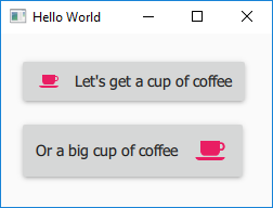
… and look at the result:
The default size of the icon (24 x 24 pixel) fits perfectly inside the material-styled Button. Even the scaled Icon looks sharp.
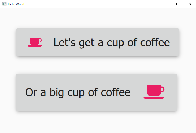
Now let’s scale the application to simulate high DPI-devices.
...
qputenv("QT_SCALE_FACTOR", QByteArray("3"));
...
This is the result:
Both buttons and icons scale perfetly.