When creating UIs it’s a common task to build your own set of reusable UI Components, if you dont want to rely on the built-in set of the framework.
I was very curious how this is done in native Android app-development and how this fancy new language Kotlin works in this context.
A quick search brought me to this excellent tutorial from Eley “Building Custom Component with Kotlin”.
So here is the goal:
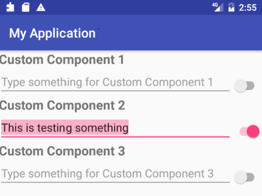
Create a reusable component which contains a label, an editable textline and a switch, formatted as you can see in the picture below (original picture slightly adjusted).
I will show the lines of code you need to achieve this goal with Native Android + Kotlin on the one hand and Android -styled QML on the other hand.
Version 1: Native Android with Kotlin
For a detailed description please check the original source.
First you need a layout xml file which contains the needed TextView as Title, an EditView a Switch and a Layout to place everything properly:
<?xml version="1.0" encoding="utf-8"?>
<merge xmlns:android="http://schemas.android.com/apk/res/android"
    android:layout_width="match_parent"
    android:layout_height="match_parent">

    <TextView
        android:id="@+id/my_title"
        style="@style/custom_component_title"
        android:layout_width="match_parent"
        android:layout_height="wrap_content" />

    <LinearLayout
        android:layout_width="match_parent"
        android:layout_height="wrap_content"
        android:orientation="horizontal">

        <EditText
            android:id="@+id/my_edit"
            android:layout_width="0dp"
            android:layout_height="wrap_content"
            android:layout_weight="1" />

        <android.support.v7.widget.SwitchCompat
            android:id="@+id/my_switch"
            android:layout_width="wrap_content"
            android:layout_height="wrap_content"
            android:layout_gravity="end|center"
            android:layout_marginTop="6dp" />
    </LinearLayout>

</merge>
Next we need a class file, written in Kotlin to initiate the visual elements an bring them to live:
package com.elyeproj.myapplication

import android.content.Context
import android.util.AttributeSet
import android.view.LayoutInflater
import android.widget.LinearLayout
import kotlinx.android.synthetic.main.view_custom_component.view.*

class CustomComponent @JvmOverloads constructor(
        context: Context,
        attrs: AttributeSet? = null,
        defStyle: Int = 0,
        defStyleRes: Int = 0
) : LinearLayout(context, attrs, defStyle, defStyleRes) {

    init {
        LayoutInflater.from(context).inflate(R.layout.view_custom_component, this, true)
        orientation = VERTICAL

        attrs?.let {
            val typedArray = context.obtainStyledAttributes(it, R.styleable.custom_component_attributes, 0, 0)
            val title = resources.getText(typedArray
                    .getResourceId(R.styleable.custom_component_attributes_custom_component_title, R.string.component_one))

            my_title.text = title
            my_edit.hint = "${resources.getString(R.string.hint_text)} $title"

            typedArray.recycle()
        }
    }

}
To expose attributes of the component we need a third file, called attrs.xml which is used inside the class constructor.
<?xml version="1.0" encoding="utf-8"?>
<resources>
    <declare-styleable name="custom_component_attributes">
        <attr name="custom_component_title" format="reference" />
    </declare-styleable>
</resources>
Now we are ready to use it in a layout file:
<com.elyeproj.myapplication.CustomComponent
    android:layout_width="match_parent"
    android:layout_height="wrap_content"
    app:custom_component_title="@string/component_one" />
Version 2: QML
The entire component consists of the following singe QML file, called “CustomComponent.qml”.
import QtQuick 2.9
import QtQuick.Controls 2.2

Column {
    id: componentRoot

    property alias labelText: label.text
    property alias editText: textField.text
    property alias checked: switchButton.checked
    signal switchClicked(bool checked)

    width: parent.width -6
    height: 60
    x: 6

    Label {
        id: label
        text: "Custom Component"
        font.pixelSize: 16
        font.weight: Font.DemiBold
        opacity: 0.8
    }

    Item {
        width: parent.width
        height: textField.height

        TextField {
            id: textField
            placeholderText: "Type something for " + label.text
            anchors.left: parent.left
            anchors.right: switchButton.left
        }

        Switch {
            id: switchButton
            anchors.right: parent.right
            onClicked: componentRoot.switchClicked(checked)
        }
    }
}
The root class of the component is a Column to layout the content vertically. It contains the Label and a second Item with contains a TextField and a Switch for which I chose the anchors system to set the layout. Three properties of content-controls are exposed easily by using property alias.
Qt creates automatically “on<property>Changed” signals (=events) to make these properties observable from outside. In this case onLabelTextChanged, onEditTextChanged and onCheckedChanged. In addition I have added a new signal (=event) called switchClicked() which is triggered when the user clicks on the switch. This helps to seperate user-inputs from programmatically changes.
The component can be used instantly when it is in the same directory, the filename “CustomComponent” is the class-name. This is the complete code of the test-application:
import QtQuick 2.9
import QtQuick.Controls 2.2

ApplicationWindow {
    id: app
    visible: true
    width: 400
    height: 620

    header: ToolBar {
        Label {
            text: "My Application"
            x: 14
            anchors.verticalCenter: parent.verticalCenter
            font.pixelSize: 16
            font.weight: Font.DemiBold
        }
    }

    Page {

        anchors.fill: parent

        Column {
            y: 6
             width: parent.width

             CustomComponent {
                 labelText: "Custom Component 1"
                 onEditTextChanged: console.log("User typed: " + editText)
             }

             CustomComponent {
                 labelText: "Custom Component 2"
                 checked: true
                 onCheckedChanged: console.log("checked changed to: " + checked)
             }

             CustomComponent {
                 labelText: "Custom Component 3"
                 onSwitchClicked: console.log("User changed checked to: " + checked)
             }

        }
    }
}
When you run the code you are getting this result:
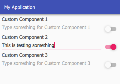
Result
Native Android with Kotlin
- We have a total of three files (located in different directories)
- The code has a total of 96 lines and 1813 characters (without space)
QML Version
- The complete component resides in one file
- The code has a total of 41 lines and 594 characters (without space)
The QML version is less than 1/3 ! of the native Android/Kotlin version and offers more functionality. And it is fully reusable for IOS and Windows Applications as well, the style changes automatically. Even more important: The complete code is readable and understandable with a glance. There is no need to check different files.